Just who decides what colors are trending each year, anyway?
It may be surprising to learn that “official” color trends aren’t necessarily driven by popularity. Instead, the International Color Authority (ICA), an international consortium of color experts, plays a major role in deciding what the next “it” color will be for clothes, cars, consumer goods—and more!
The ICA analyzes cultural, social, and psychological factors, organizing their findings into directives that influence industries and determine which colors are embraced and promoted throughout the next few seasons.
Members of the ICA work in an array of professions, ranging from interior and industrial design to fashion and manufacturing. The organization tracks naturally occurring color trends, consumer behavior, societal changes, and the psychology of color to formalize color palettes. The resulting color schemes that characterize almost every consumer product spotted on shelves, online, and in social media are actually determined by the ICA two years in advance. Those choices color (literally!) the aesthetics utilized by public-facing industries, including textiles, paint, home goods, furniture, automobiles, and more.

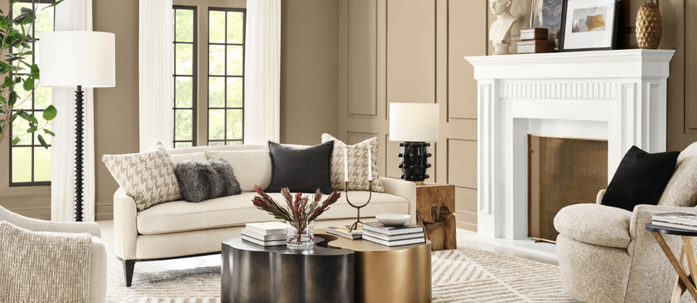
Sherwin-Williams Color of the Year 2026 – Universal Khaki
Many paint companies announce a color of the year, largely based on the ICA’s studies and selection. Sherwin-Williams color of the year for 2026 is Universal Khaki, an earthy, beige midtone neutral with a soft yellow undertone that represents contemporary comfort and timeless appeal. Neither too dark nor too light, it is a truly versatile base color around which to build a vibrant and sophisticated extended color palette.
An Essential Neutral
“Universal Khaki is the easy-going neutral feel pulled together,” said Sue Walden, Director of Color Marketing at Sherwin-Williams. “Its warm, earthy tone works with natural finishes, crisp whites, or bold pops of color, bringing timeless style to your home.”

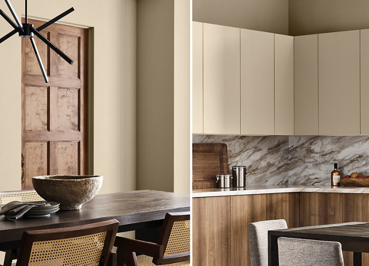
Large swatches show how a color will truly look in the space.
Don’t Start Painting Yet!
Before you pick up that paintbrush, put your new paint color to the test.
Whatever the color—even white—and wherever it’s used, inside or out, it’s crucial to properly swatch it, and the process is simple. Ellen recommends skipping the tiny test cans available at the hardware store and springing for the larger quart instead. That allows for a much larger test area to be swatched than with the small sample. That tiny patch will not deliver an accurate representation of how a color will look after the entire wall—not to mention the room—is painted in it.
The larger swatch makes it easier to see how the color will actually look in the space or from the street. It will cost a little more and take more time, but not as much as it would to repaint an entire room that did not meet expectations.
Lighting
Paint color can look dramatically different in different lighting. Direct or indirect sunlight, incandescent bulbs, and LED lighting all change how color appears. Checking how the color looks throughout the day in various lighting scenarios helps ensure that it remains pleasing morning, noon, and night.
The underlying “temperature” of a color also changes with the amount and type of lighting in the room. Warm colors (think reds, oranges, and yellows) are ideal for creating a cozy, inviting atmosphere. Cool tones (like blues, greens, and violets) create a calm and spacious feel. Natural light can enhance the vibrancy of warm tones or soften the look of cooler shades, while artificial light warms them up but intensifies warm colors. It’s all too easy for homeowners to be disappointed when the color they fell in love with in the paint aisle does not satisfy when tested in the home, largely because of the warm or cool undertones and the effect that light has on them.
To ensure a uniform look, do not mix paint brands, even if they offer the same color.
Stay On-Brand
Beware of “crossover” colors—seemingly identical colors, sometimes with even the same name, but from different paint companies. Different companies use different bases, and the final color and sheen will be different, too. Ensure a true match by buying the same brand.
Paint base is important! It impacts how light or dark a color will appear. Clear or deep bases are used for dark, saturated colors, while light or white bases are best for brighter, softer hues. Glossy finishes will reflect more light, making colors more vibrant and reflective. However, high-gloss can highlight flaws in surfaces, making careful prep work necessary. Matte finishes absorb light, subduing light colors, deepening dark ones, and making slightly imperfect surfaces less noticeable.
Ellen’s Here to Help!
Whether you need a recommendation for a reliable home painter or need guidance on refreshing paint before selling your home, give Ellen a call at (816) 489-6950 or click here to send her a message online! Let her home expertise help you make smart paint upgrades with confidence!


